

Value Tracking Dashboard
aPriori is a B2B SaaS platform that helps manufacturing engineers simulate and reduce production costs. This project was aPriori's first executive-facing dashboard, designed to make the software's ROI visible and self-serve for engineering leadership.
My Role
Sole Designer
Timeline
2024 - 2025
Platform
Web app,
Looker
Team
Designer, PM (1), Engineer (2)
The Problem
aPriori's software helped engineering teams reduce manufacturing costs, but executives had no way to see that ROI without building it themselves. Some customers were manually compiling monthly slide decks with cost data to justify their subscription to leadership. This was time-consuming, inconsistent, and putting renewals at risk.

Time-consuming Powerpoint Slides
Target Users
VP of Engineering
Needs a quick read on whether the software investment is paying off.
Engineering Manager
Needs to diagnose which departments or projects are underperforming.
My Approach
The PM and I ran multiple rounds of VoC to understand what users needed to see and how. Using NotebookLLM and Gong, I quickly synthesized and affinitized customer feedback from recording, cutting down analysis time significantly. Based on customer feedbacks, we refined charts and graphs until each visualization was accurately communicating the right data. But something was missing; each one worked in isolation, with nothing tying them together into a coherent whole.


Initial set of visualizations I designed
Refined visualizations

Storyline created to achieve user goals

So the PM and I sat down to revisit the core goal each persona was trying to achieve. From that conversation, I outlined a storyline for each. And that shifted my framing from data visualization to storytelling.
The executive opens the dashboard, spots an underperforming department, and directs the manager to course-correct. The manager drills into projects, identifies the issue, and monitors recovery.
That two-act narrative became the structural foundation of the layout; a deliberate top-to-bottom funnel from executive summary to operational detail.
Storyline mapped to dashboard layout
Final Dashboard
.png)
KPI cards lead the page at the largest type size. Executives get their answer in seconds without wading through charts
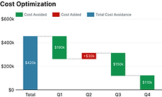
Usage by group + cost optimization trend sit in the middle. Context for the headline numbers
User and project tables at the bottom. Operational detail for managers doing analysis
Designing within Looker's constraint
For example, automatic time-cadence adjustment on the bar chart conflicted with custom date filters, requiring a unified custom filter instead of the preset shortcuts I originally designed
Outcome
The dashboard replaced a manual, inconsistent reporting process with a self-serve experience for executives. Qualitatively, it directly contributed to retaining at least one customer who was on the verge of churning, turning an invisible value problem into a visible one.

What I'd do differently
The component-level drill-down was added reactively after beta feedback. Bolting a modal onto an existing table created discoverability issues and forced awkward workarounds in Looker. Had I designed for both project and component-level views from the start, the information architecture would have been cleaner.